
Raw Indulgence - The Brand Development
Guide Project
Logo Development & Design, Brand Development Guide Design, Newsletter Design, Billboard Design, Social Media Content Design, App Mockup Design, Website Mockup Design and Business Card Design
CHALLENGES OF THE PROJECT
A brand development guide involves a large process showing how a brand develops from scratch and also highlights the design of the brand itself. I chose to embody a fictional luxury, organic skincare brand named Raw Indulgence, with a brand story to match. Typographic skeleton development, as well as logo typography development, were some of the challenges faced when designing the guide. Determining a colour palette and the visual identity of the brand itself also proved to be a challenge.

PROBLEM RESOLUTION
To mitigate each of the challenges I faced, I chose to focus on each aspect individually. For the colour palette, I examined colour palettes of other luxury skincare brands, including research on the type of colours used in their advertising, their brick-and-mortar stores, as well as in the logos of the respective companies themselves.
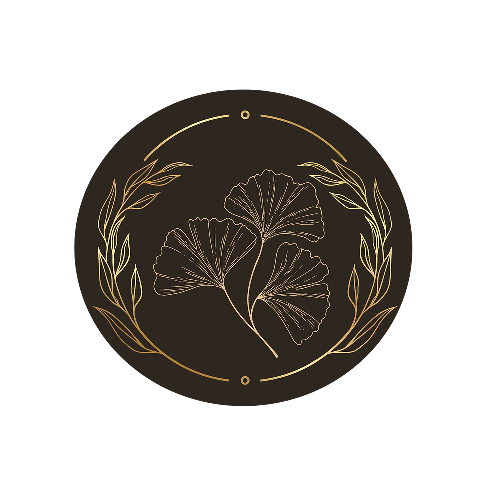
The typographic exploration focused on a set of elegant typefaces that would portray the feeling of a luxury brand. In the same way, the logotype development also compared several variations of the final logotype and chose the best version. The logo development itself focused on a set of easily recognisable elegant black and gold (white and gold when required) elegant curves depicting elements found in the natural world.

KEY TAKEAWAYS AND
SIGNIFICANT RESULTS
One of the most significant takeaways was
an insight into a logo set development process. The modular system involved the use of a set of logo styles depicting nature. Each logo and logotype combination would be used across different channels, for example, delivery vehicles would use one combination and staff uniforms would use another. The presence of the same
colour scheme and gold leaves of each logo make the brand recognition synonymous.
Another important takeaway was learning the entire brand development process from scratch, and being able to develop a fully comprehensive guide for a fictional brand.
.jpg)
.jpg)


.jpg)
.jpg)
.jpg)
.jpg)
.jpg)
.jpg)
.jpg)
.jpg)


