Image Making Projects
Connotative & Denotative Subject Portrayal, Typographical Associations, Natural and Artificial Design Integrations, Icon Exploration using Simple Shapes, Poster Design
and Pattern Design
Image Making Projects
Connotative & Denotative Subject Portrayal, Typographical Associations, Natural and Artificial Design Integrations, Icon Exploration using Simple Shapes, Poster Design
and Pattern Design
Image Making Projects
Connotative & Denotative Subject Portrayal, Typographical Associations, Natural and Artificial Design Integrations, Icon Exploration using Simple Shapes, Poster Design
and Pattern Design
CHALLENGES OF
THE PROJECT
PROBLEM RESOLUTION
KEY TAKEAWAYS AND
SIGNIFICANT RESULTS
1) This project challenged me to think of the various ways I could depict the two subjects that I had chosen. For this project, I chose a pineapple for my first subject and a penguin for the other. Creating a typography set which would bring up associations with the subject was very challenging as well.
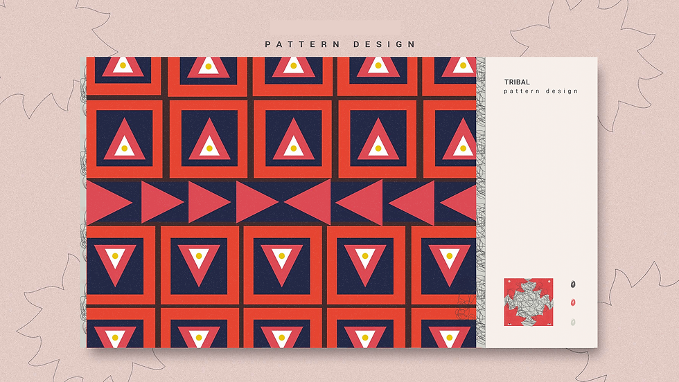
2) The typography-based poster introducing a font inspired the use of 3D typography. The project also included the creation of a pattern associated with a culture or tribal group, and icon exploration using simple shapes, both of which were challenging.
To effectively construct variations of both the
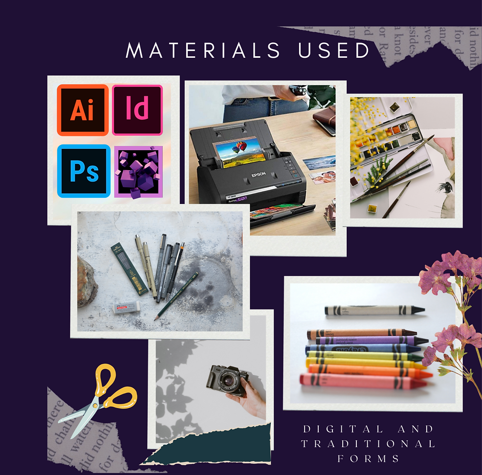
objects that I chose, I employed the usage of both digital and traditional forms. I used paper scraps from newspapers, sketching materials such as markers and pencils, paintbrushes, collage paper scraps, magazine cutouts and I even used dried flowers as methods of construction in the traditional medium.
The digital medium employed the usage of 3D modelling software, as well as the Adobe Suite of design tools. A scanner and a camera
were also used in the image-making process.
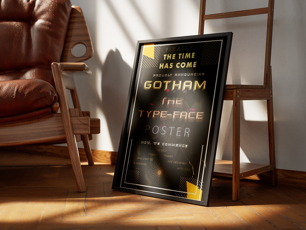
The Typography based poster had restrictions, such as only using typography, with no imagesor main illustrations. The font I chose to introduce was Gotham, and the poster was created in a style that would introduce the font to the city of Gotham featured in the Batman Franchise. Since Gotham is a geometric sans-serif, I had to find ways to transform the geometric shapes into unique creations.
Typographical research was also conducted to determine which typographies would suit and represent both of the subjects in the
most accurate way possible. Research was also conducted on Native American tribal patterns and the symbolisms involved in their culture to fully embody the pattern development. The icon exploration explored the different ways shapes could interact with
each other to create a final result - an icon that
would be recognisable as a single entity.
One of the essential takeaways from this project was gaining a much deeper understanding of the various ways that simple objects perceived in a single way by society could be manipulated and portrayed in different forms as a designer.
I gained experience in portraying objects in different ways, whether that be denotative or connotative, and how each method sends out very different messages to the audience. The icon exploration invited me to create a set of interesting icons which would stir up feelings
and associations with the world around us. The Typographic poster helped me challenge
myself to design using just words, and helped
me gain a better understanding of 3D effects.
Extensive typographical research into the
typographies that would match the subjects
as a part of the project was also very helpful,
since these are also an essential part in the
look and feel of a design. The pattern research
was also very interesting, and I learnt about the
Native American culture in greater detail, and
also how patterns of cultures, subcultures, tribes and native peoples can be integrated into designs to create unique results.


